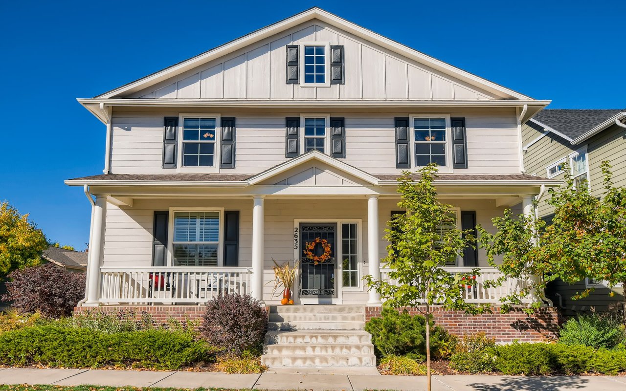
One of the easiest and most impactful ways to transform a home is with color. A fresh coat of paint doesn’t just brighten up a space—it can set the tone, affect your mood, and even change the way a room feels in terms of size and light. Over the years, helping clients buy and sell homes across Denver, I’ve seen firsthand how powerful color choices can be. It’s not just about personal taste—there’s real science behind how color influences our emotions and experiences within a space.
In this post, I want to walk you through how to choose the perfect paint tones for every room in your home. Whether staging your home to sell or simply refreshing your space for a more harmonious feel, understanding how color works is a great place to start.
Understanding the Psychology of Color
Colors evoke emotional responses, often in subtle and subconscious ways. Understanding color psychology can help you create rooms that are not only beautiful but also functional in how they make people feel.
Here are some basic emotional associations with common colors:
Here are some basic emotional associations with common colors:
- Blue: Calm, soothing, and serene. Often used in bedrooms and bathrooms to create a relaxing atmosphere.
- Green: Balancing, refreshing, and peaceful. Works well in offices, living rooms, and kitchens.
- Yellow: Cheerful, energizing, and warm. Great for kitchens and breakfast nooks.
- Red: Bold, stimulating, and passionate. Best used as an accent or in spaces meant for lively interaction like dining rooms.
- Gray: Neutral, sophisticated, and versatile. Ideal for virtually any room.
- White: Clean, open, and minimalistic. Expands space and reflects light beautifully.
- Brown/Beige: Grounding, warm, and natural. Provides a great foundation and pairs well with many accent colors.
Room-by-Room Color Recommendations
Let’s dive into how to choose the right tones for specific rooms in your home. I’ve helped countless clients update their interiors, and I always encourage them to consider how they want each space to feel—not just how they want it to look.
Living Room: Warm Neutrals and Inviting Tones
The living room is often where families gather, guests are entertained, and evenings are spent unwinding. You want it to feel welcoming and comfortable.
Color suggestions: Warm greige (a blend of gray and beige), soft taupe, warm whites, or earthy greens. These tones make the space feel cozy while still being flexible enough to work with various décor styles.
Color suggestions: Warm greige (a blend of gray and beige), soft taupe, warm whites, or earthy greens. These tones make the space feel cozy while still being flexible enough to work with various décor styles.
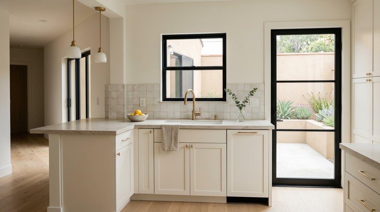
Kitchen: Energetic Yet Clean
Kitchens are active spaces that should feel both functional and alive. Lighter colors can help reflect natural light and give the room a bright, fresh feeling.
Color suggestions: Soft whites, sage green, muted yellow, or cool light gray. If you want to add a punch of personality, consider painting the island or lower cabinets in a contrasting but complementary color.
Color suggestions: Soft whites, sage green, muted yellow, or cool light gray. If you want to add a punch of personality, consider painting the island or lower cabinets in a contrasting but complementary color.
Dining Room: Bold or Elegant Accents
Dining rooms are where you can take a bit more risk with deeper or richer colors since you don’t typically spend as much time in them as other rooms.
Color suggestions: Rich navy, deep burgundy, forest green, or warm charcoal. These colors can create a sense of intimacy and luxury, especially when paired with dramatic lighting.
Color suggestions: Rich navy, deep burgundy, forest green, or warm charcoal. These colors can create a sense of intimacy and luxury, especially when paired with dramatic lighting.
Bedroom: Tranquility is Key
Bedrooms are personal sanctuaries, and color can help create a sense of peace and calm. Opt for shades that help the mind and body relax at the end of the day.
Color suggestions: Soft blue, dusty lavender, warm gray, or muted sage. Avoid anything too bright or stimulating.
Color suggestions: Soft blue, dusty lavender, warm gray, or muted sage. Avoid anything too bright or stimulating.
Bathroom: Clean and Spa-Like
Bathrooms benefit from colors that feel fresh and clean, but you can also play with spa-inspired hues that evoke relaxation.
Color suggestions: Pale blue, seafoam green, classic white, or dove gray. If your bathroom lacks natural light, warmer tones or creamy whites can prevent it from feeling too stark.
Color suggestions: Pale blue, seafoam green, classic white, or dove gray. If your bathroom lacks natural light, warmer tones or creamy whites can prevent it from feeling too stark.
Home Office: Focus and Clarity
Since so many of us work from home these days, it’s important to create a space that enhances productivity and focus while still feeling inviting.
Color suggestions: Soft greens, slate blue, or even a warm beige. These colors are known to encourage concentration and reduce eye strain. If you're feeling bold, a single accent wall in a deeper tone can add interest without being distracting.
Color suggestions: Soft greens, slate blue, or even a warm beige. These colors are known to encourage concentration and reduce eye strain. If you're feeling bold, a single accent wall in a deeper tone can add interest without being distracting.
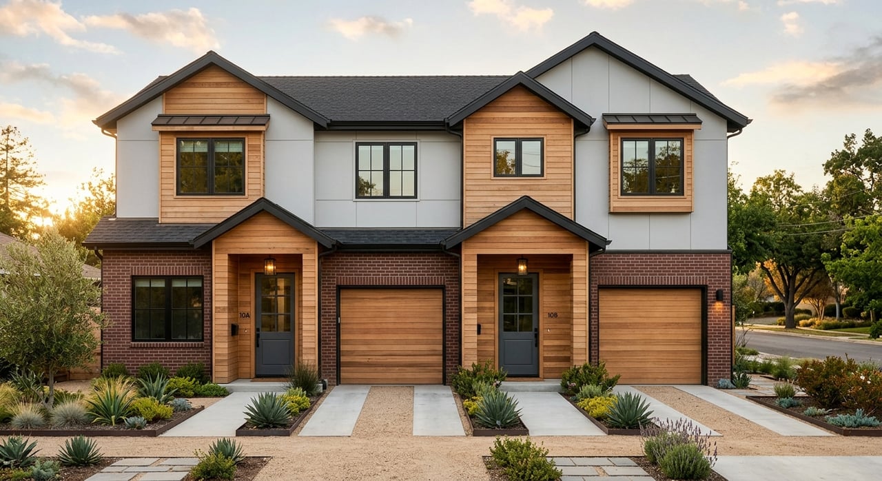
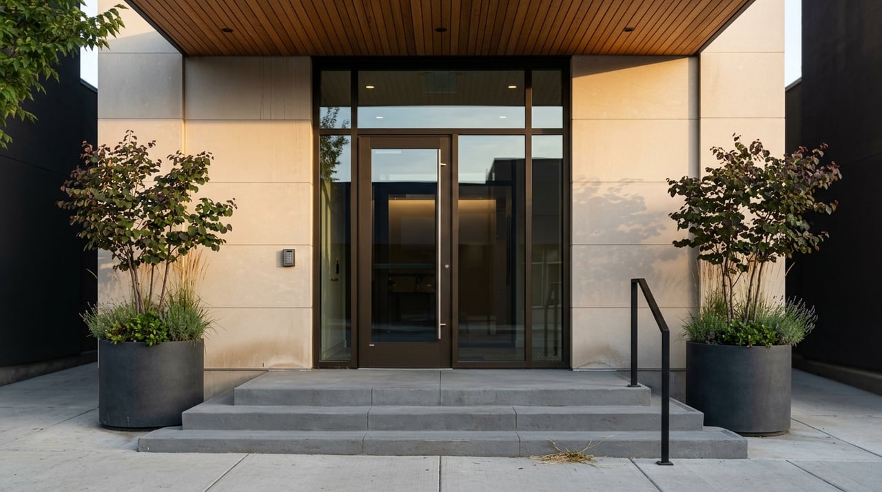
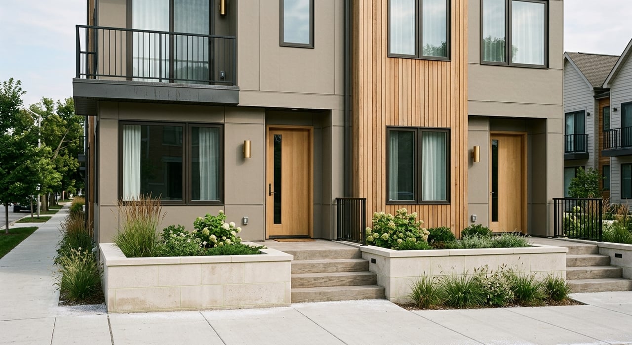
Entryway: First Impressions Matter
Your entryway sets the tone for the rest of the home, so choosing a color that’s both welcoming and reflective of your personality is key.
Color suggestions: Soft neutral tones like light gray, warm cream, or even a muted teal or olive. These create a cozy transition from the outside world into your personal space.
Color suggestions: Soft neutral tones like light gray, warm cream, or even a muted teal or olive. These create a cozy transition from the outside world into your personal space.
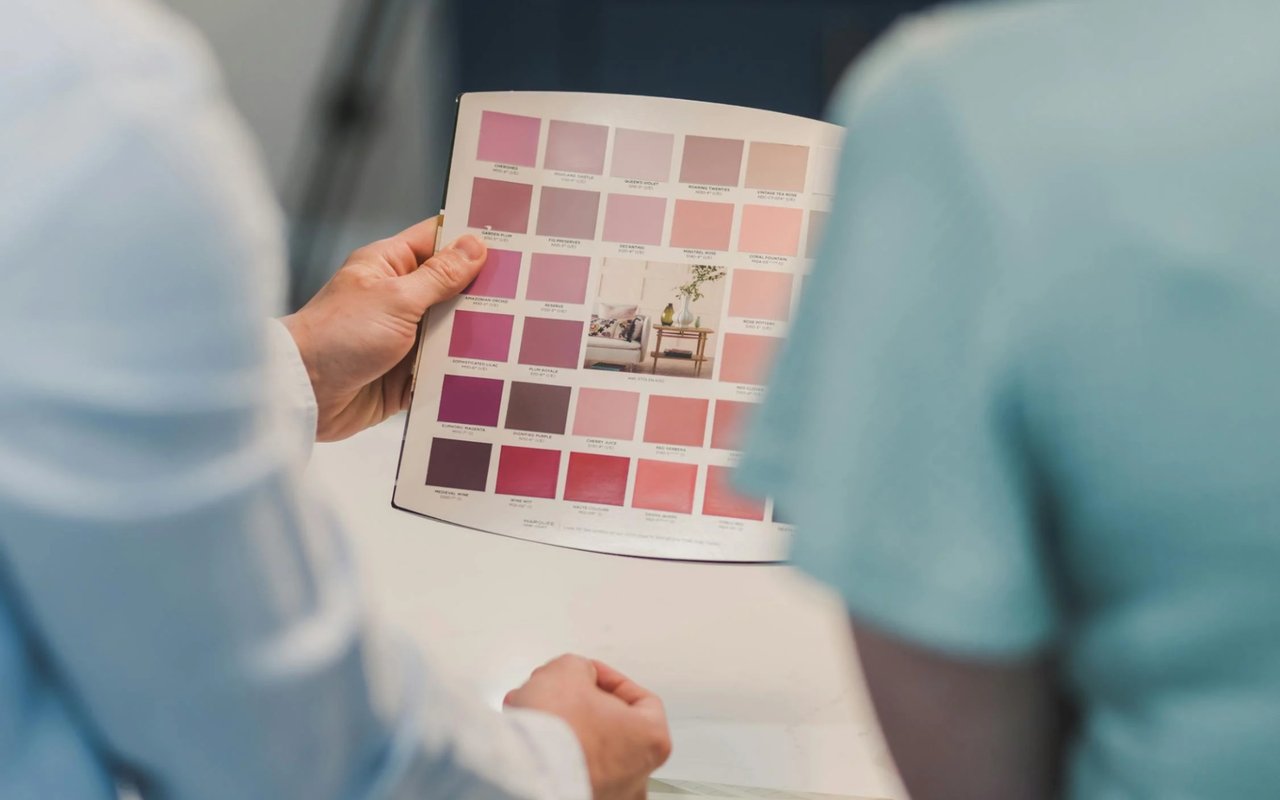
Tips for Choosing the Right Shade
Once you’ve chosen your color family, the real work begins—picking the right shade and finish.
Here are a few tips I share with my clients to make the process easier:
Here are a few tips I share with my clients to make the process easier:
- Test your colors: Don’t rely solely on paint chips. Sample the paint directly on your wall and observe how it looks at different times of day in natural and artificial light.
- Mind the undertones: Even neutrals have undertones—some are cool (blue, green) while others are warm (yellow, red). Pay attention to how these undertones interact with your flooring, furniture, and natural light.
- Consider flow: If you have an open-concept home or adjoining rooms, think about how colors will transition. Use complementary tones or variations of the same hue to create a cohesive flow.
- Start small: If you’re unsure, start with a smaller room or an accent wall. This allows you to experiment without committing to a full-room transformation.
- Use sheen strategically: High-gloss or semi-gloss finishes are great for kitchens and bathrooms because they’re easy to clean. Matte or eggshell finishes work well in living areas and bedrooms where you want a softer look.
Color Trends vs. Timeless Tones
I’m often asked if it’s better to follow current color trends or stick with timeless classics. My answer? It depends on your goals. If you’re painting to sell your home, neutrals and universally appealing colors tend to perform best. If you’re updating your home to enjoy it more, don’t be afraid to inject some personality. Just be sure it feels balanced and true to your style.
Right now, nature-inspired tones like soft greens, earth tones, and warm whites are very popular—and they also happen to be timeless. That’s a win-win.
Color can completely transform your space and elevate your home’s mood, comfort, and appeal. Whether revamping your current home or preparing it for sale, thoughtful paint choices can make a lasting impact.
And if you’re feeling overwhelmed or unsure where to begin, I’m here to help. As a real estate agent with an eye for design, I regularly help clients find homes and make them beautiful and functional. From color consultations to preparing your home for sale, I bring experience and care to every step of the journey.
Ready to bring new life to your space—or find a home that’s ready for your perfect palette? Visit kimberward.com to get in touch. I’d love to help you unlock the full potential of your home—one paint stroke at a time.